elizabew – Looking Outwards – 09 – sectionE

I decided to look through my friend Rachel Farn’s work, and I found her discovery of the media visual artist Alex Mcleod to be interesting. I found that her focus on his piece Mystic Pond (2010) really drew me into wanting to read more about the artist — this image of the piece looked unreal.

Mystical Pond (2010)

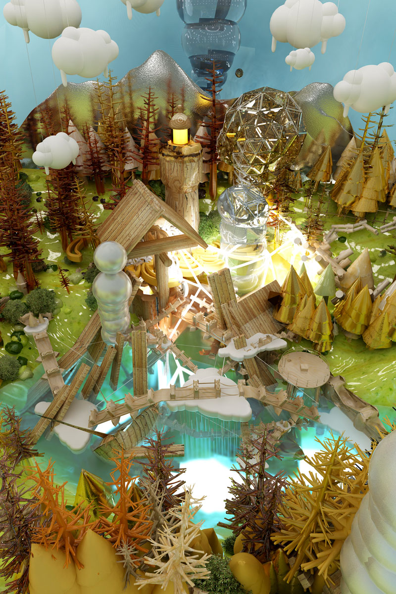
I absolutely agree with Rachel that his art connects traditional artists and graphic animation. Alex creates “paintings” that push the limits of traditional artists while integrating modern technology into his work. The works show so much detail that it’s fun to look at one piece and try to dissect it. (His work Forest City (2011) reminded me of The Hobbit)

Forest City (2011)

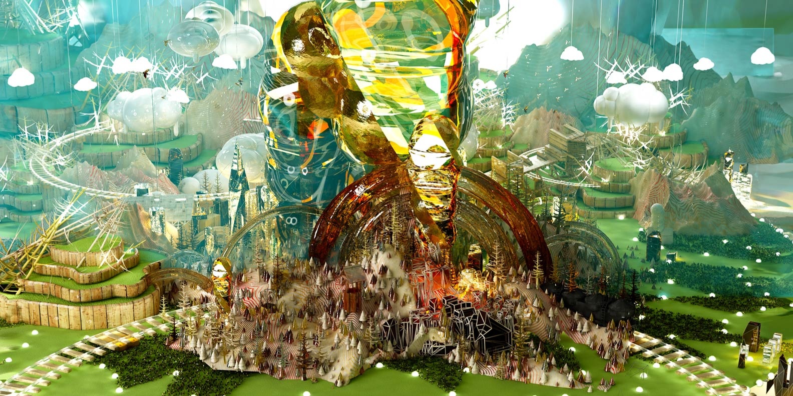
To add to what she’s already written, I would also like to say that Alex’s work really grasps landscapes in an otherworldly way — some of his work reminds me of futuristic films. And while incredibly bright and colorful, there’s a hint of uncomfortableness from these unsettling works. It is almost like each photo describes a different world and it’s up to the viewer to figure out what kind of place it is. To me, personally, I find that most of them look like dystopian, sometimes even alien places.


CLICK HERE for Rachel Farn’s Looking Outward

Click here for more on Alex Mcleod

LookingOutward-09

For this weeks post, I decided to write about my friend Elizabeth’s looking outwards post on the Sugarcube MIDI controller. Similar to her post, I agree with the satisfaction of the interaction with the Sugarcube.  What I found so fascinating about the device is how accurately it can imitate the movement of a marble or a surface. In one setting, it uses simple lights to imitate physical movement of solid objects.

Sugarcube

The project was created by Amanda Ghassaei, a grad student at the Center for Bits and Atoms at MIT Media Lab.

In addition to imitating simple movements, the Sugarcube also has many settings that create patterns of light and allows the user to interact with the lights as buttons. Besides lighting up and creating a visual performance, the device also emits sound and noises, allowing the user to use both senses and play around with sound and visuals. I find it interesting how this simple tool can be used as an educational tool and stimulate the user both visually as well as audibly.

http://www.instructables.com/id/Sugarcube-MIDI-Controller/


hyt-Looking-Outward-09: Peer Evaluation


ikrsek-Looking Outwards-05

Zolloc GIFs - Find & Share on GIPHY

When I saw Hayden Zezula’s project, I was completely mesmerized and at the mean time touched by its visceral use of repetitive elements — human body parts, graphic 3D waves, etc. Similar to what the original post said, I think it’s particularly relevant to some of the physics features we are currently learning in class — law of attraction, gravity, etc., and I think it would be interesting to do some research on the technical motions. Also, its choice of colors and dimensionality is also something to learn more about.

Another topic that I related to this artist is the boundary between commercial and conceptual artworks. After seeing his collaboration with lots of big-name commercial brands, as well as exposing himself on Instagram and GIF pop-culture websites, it may be hard for many to categorize him as a traditional artist, but I think his creativity is unparalleled to others, and that he is a concrete evidence of further interdisciplinary blend between technology and art.

You can view more of his works here: https://www.instagram.com/zolloc/


aerubin-LookingOutwards-09-Section-C

Anna Boyle wrote about the Flow Machines Project for her Week 4 Looking Outwards post. This project was designed to have a computer program compose music in the style of a specific composer. The video Anna provided was a computer composed piece in the style of the Beatles. She writes about the mathematical algorithms utilized to create sequences that then are combined to create a piece.

Although the melodies are composed utilizing this algorithm, there are still aspects of the piece that are created with help from human intelligence. The harmonization is all done by people as chord progressions that make musical sense are difficult to accomplish because the melodic line effects the sound of the chordal progression. In addition, the words were composed by humans as the syllables of the words must match the music and make cohesive sense. So although the melodic line is computer generated, many other aspects of the piece are still composed by humans.

Link to Anna’s Blog Post

thlai-LookingOutwards-09

2016 AICP Sponsor Reel

I asked my friend Heidi what her favorite Looking Outwards project was, and this was it. I had actually watched this video before – I think it went viral about a year or so ago. I agree with what Heidi says in her Looking Outwards post: “…it looks so believable, and yet the textures and behaviors of the people dancing…would never make sense in real life.” When I first watched the video, I actually thought it was people dancing in intricate costumes because the movements and textures looked so realistic. I think the dancing and colors really capture the energy of the music, and the fast paced changes in costume keeps the viewers on their feet and keeps them interested. I think the creators did motion capture technology justice. I agree with what Heidi says her her post. The project is incredibly imaginative and entertaining to watch.

dnam-LookingOutwards-09

For this week’s Looking Outwards assignment, I looked at the writing by my close friend, Na Hyun Kim. On week 4, she looked at different types of sound arts and decided to further explore loop sounds in music. She linked the topic of sound art to something that she is interested in. She further discusses loop music by giving an example of a youtube musician who used sound loops to cover songs. This is the youtube video mentioned before, and Na Hyun’s Looking Outwards post can be found here.

mstropka-Looking Outwards-09

https://blog.twitter.com/official/en_us/a/2013/the-geography-of-tweets.html

For this week’s looking outward assignment I looked at Asher Blackburn’s looking outwards 7, which is a visual map of where people have tweeted from. This caught my eye for the same reasons that he wrote about in his looking outwards post in that the concept is very simple, but the resulting image is incredibly complex and interesting. The map has billions of points from months of data collection and when all of these points are plotted, the map begins to raise questions. For example, after looking at the map in detail you start to wonder about why certain areas send more tweets than others, why one person is sending a tweet in the middle of nowhere, and what is the content of these tweets.

It would be very interesting if the map were able to link to the tweets that were sent out at these locations. Looking at the map, I am very curious what users are sending out at these locations and times. I would like to be able to look more in depth and answer some of these questions with the help of the map.

LookingOutwards-09

gyueunp – Looking Outwards 05

The Looking outwards Im referencing

VOID from Chris Bjerre on Vimeo.

This project was interesting to me because it shows how art & coding intersects with commercial product. Also the visuals were unsettling in a poetic way where the coding of pattern did not feel forced and the sole focus, more a tool used in a larger narrative. The part I found most interesting was Bjerre’s project titled ‘VOID’ which Gyueun linked in her post. I agree with Gyueun’s attraction towards the “simple yet complex visual structures” in the linked projects. Bjerre’s work aims to unsettle the viewer through visuals and audio and VOID was a project that did both of these things along with an original non-dialogue narrative.  

hannahk2-LookingOutwards-09

I chose Clarisa’s looking outwards from week 2, because I can relate to her fascination with virtual reality after experiencing it for the first time recently. I think the project she chose, Memo Akten’s Fight (2017), is really amazing and I agree with Clarisa in that the most interesting aspect is its variability- no two people will see and interpret the visuals in their brains the same way, though the images stay constant with each showing. I think it is important, however, to highlight how the artist achieved this effect by utilizing his knowledge of psychology and the binocular rivalry phenomenon. While looking around, the viewer’s brain chooses which aspects of the two images shown become dominant or suppressed, presenting the viewer with an animated patchwork of the two images. Even more amazing is the message that the picture we see in our minds is not a clear representation of the outside world, but of simulated world constructed based on our expectations and prior experiences.

http://www.memo.tv/fight/

(the link to the work)

cespinoz-Looking Outwards 02

(the original looking outwards post)

(the simulation of the mixing of the two images within the brain)

fight_snippet_4 from Memo Akten on Vimeo. (a clip of the two images shown in the VR)

LookingOutwards-09-LookingOutwards!


SEM scans of various plant seeds colorized

Supawat’s Looking Outwards Post

This week, I’d like to address Supwat’s Looking Outwards post from Week 5, where he writes about the magical microscopic universe uncovered through colored electron microscopy (SEM). It was really interesting to read an alternative perspective on one of the Miller Gallery’s most exciting exhibitions (in my opinion), World Within, created and curated by Rob Kesseler. What was most surprising to me when observing the artifacts and documentation of this photographic process is that SEM scans are taken only in black and white.

Here’s how it works: Through a an electric light filament, the machine shoots a flow of electron through a pair of electromagnetic lenses. The beam is varied and scans itself across the studied object. Depending on the position of the beam, an electron detector collects data from the secondary electrons that are repelled back from scan. After that, the image is run that through some filters that result in a extremely high resolution black and white image.

While these images are quite impressive on their own, without the sensibility of the artist who colors and shades these images, we wouldn’t be able to experience such evocative and beautiful colored imagery. It’s refreshing to find this kind of artistic collaboration even in the most dense and complex scientific studies.

Here is the tutorial Supawat linked that reveals the methodology behind coloring SEM scans:
Tutorial on Coloring SEM Scans

I took a gander and was truly blown away 🙂