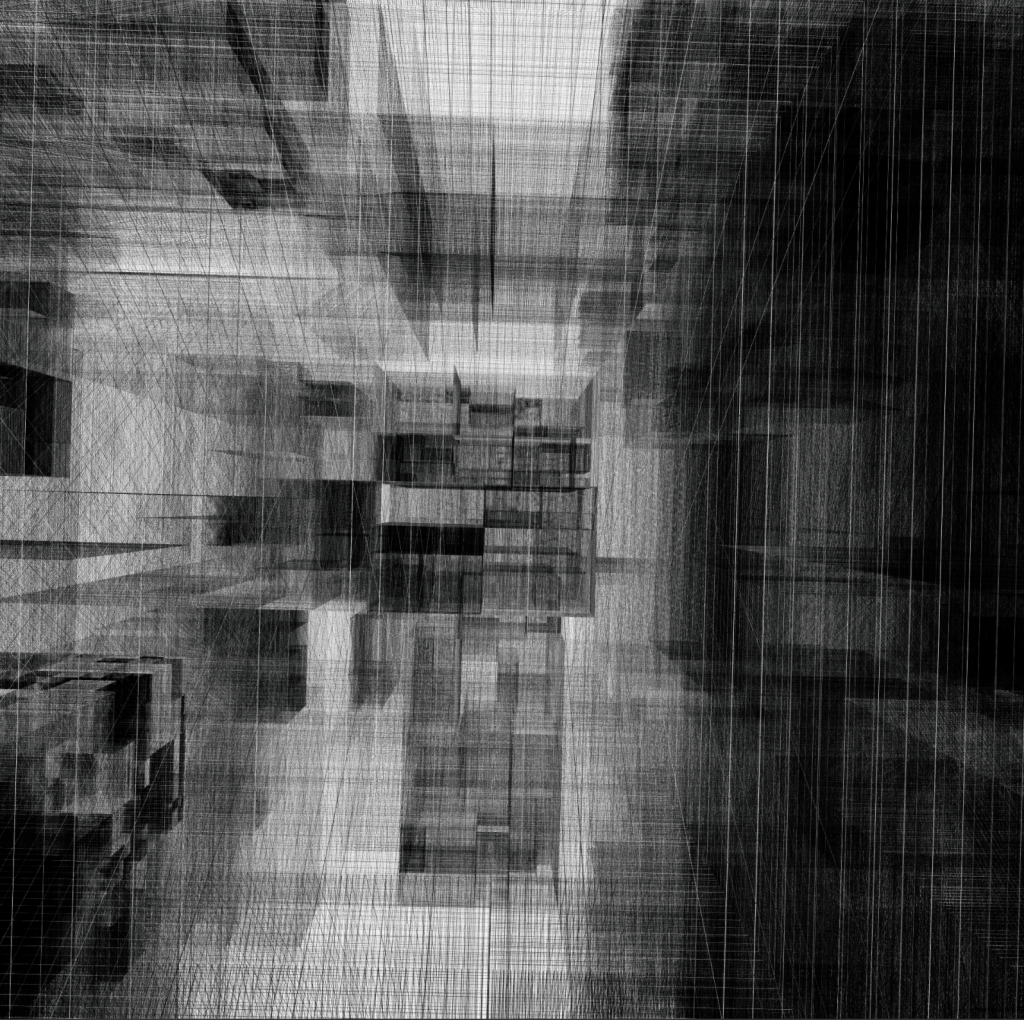
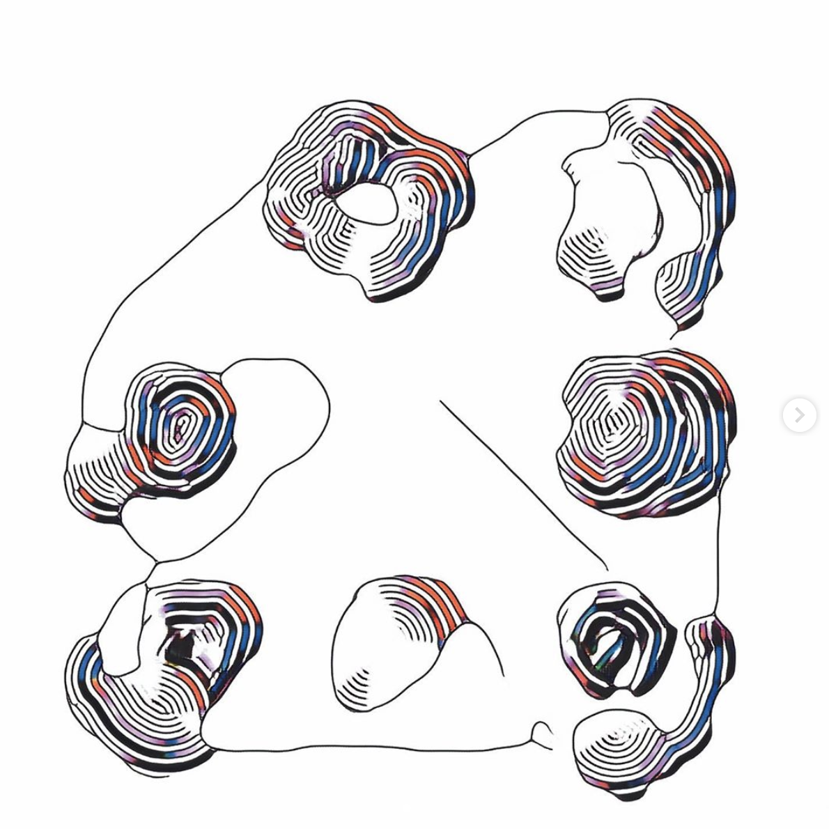
hhmbrrs by Manolo Gamboa Naon is really interesting to me because the works create planes seemingly out of nothing; it’s made purely out of intersecting lines. The resulting forms create a sense of depth which I find very cool.
60-212: Interactivity and Computation for Creative Practice
CMU School of Art / IDeATe, Fall 2020 • Prof. Golan Levin
hhmbrrs by Manolo Gamboa Naon is really interesting to me because the works create planes seemingly out of nothing; it’s made purely out of intersecting lines. The resulting forms create a sense of depth which I find very cool.
I chose this piece of work by Zach Lieberman because I love how elegant the movements of the dynamic composition are. The color transition is also smooth and visually pleasing. It’s also amazing that lots of his works are done in series of explorations so that they will show relations with each other, but at the same time each individual work is a new exploration with different variations.
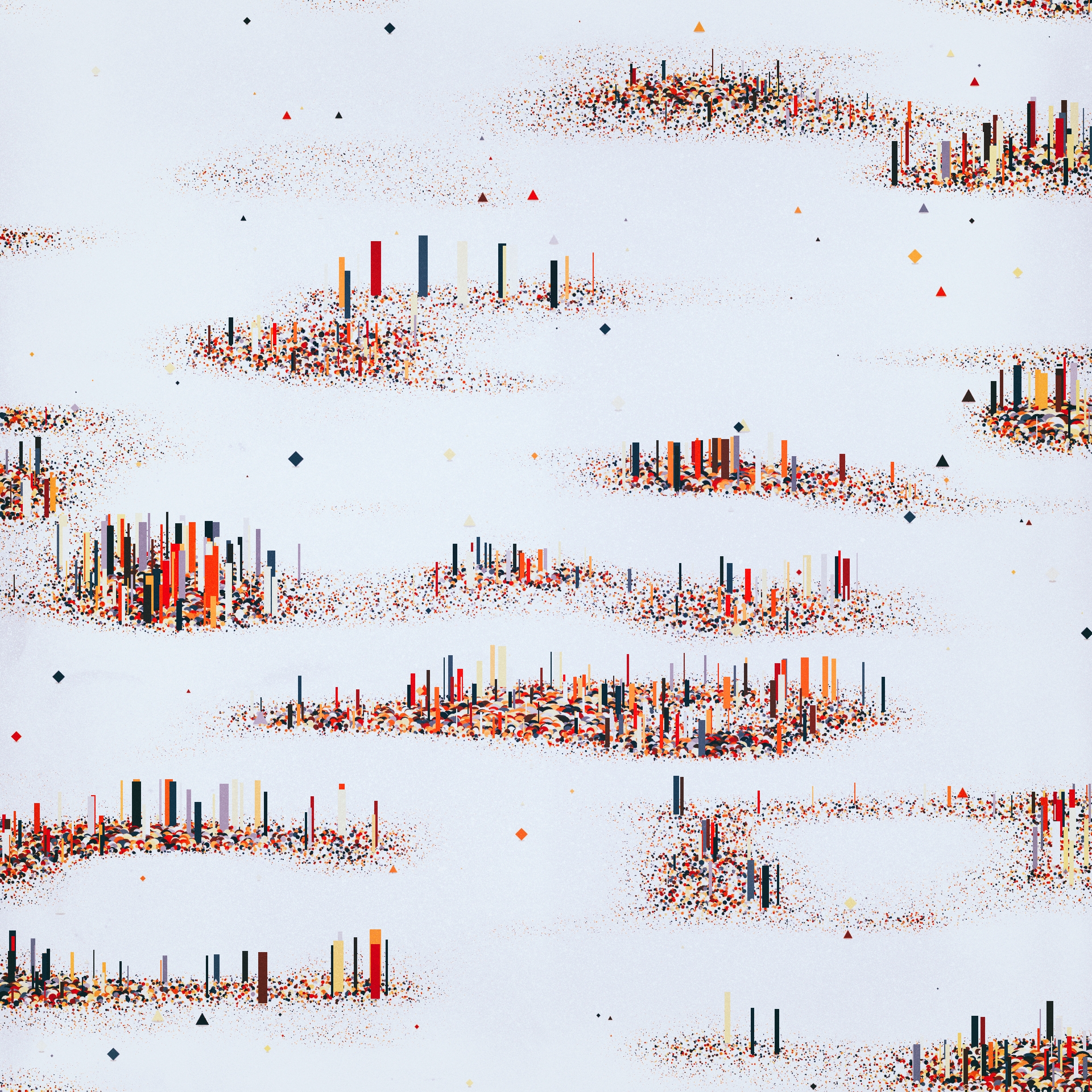
What drew me to this piece by Manolo Ide was the quietness created by the cold white in contrast with the bright city like buildings. I really like the way the buildings curve around the screen resembling how a real city scape would look like as well as the numerous little squares that represent building and makes me want to figure out how this piece was made.
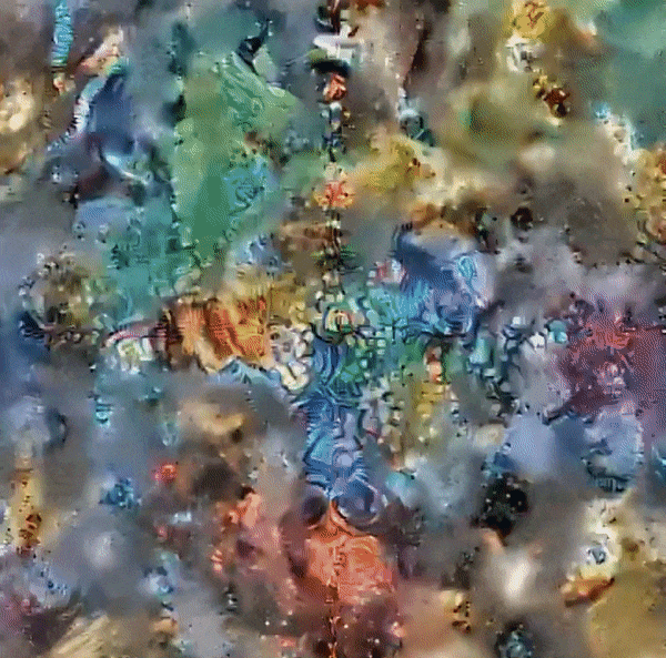
This piece to me by Manolo ide just was really visually fascinating to me because of the almost topographical nature of the gradient shapes. I really like the almost optical illusion nature of this piece and how it feels almost three dimensional, when I first looked at this I just imagined myself laying down on top of this image. Very nice.
I also found this project by Zach Lieberman that I found really beautiful, I don’t know if it is generative but the way this project plays with typography is gorgeous to me, especially the way the texts organically disintegrates.
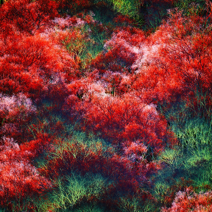
I chose this project by Manolo Gamboa Naon because I just love the idea of trying to replicate Earth’s complicated and beautiful nature through technology. I appreciate this piece’s intricate details and the amounts of layering that occurred. I love the complementary colors of red and green that contrast each other beautifully, and the layering of artifacts creates almost a visible texture.
I chose Helena Sarin’s work, as I like how the work represents human taste, while taking advantage of the computational medium. The organic lines and composition makes you believe that this was a doodle, but the intricate ‘maze’ in each blob was made possible through the precision of a computer.
I enjoy simple and honest graphical forms, and this piece seems to achieve that in an interesting way.
Any visual that can make my mind wonder all the things that it could be always will have a special place in my heart. It makes me think: what is what is adapting? Is it my eyes or is it the artwork? I truly enjoy watching Sophia’s exploration of artificial lifeforms and nature itself.
Fluid Leaves – Reinoud van Laar

Fluid Leaves is a project made by Reinoud van Laar for tea boutique, ‘Tee & Cupp’ in Xian. This project generates prints of non overlapping leaves in a fluid pattern similar to that of tea leaves floating in water onto paper cups.
The elegance of each print initially drew me into the project such as the delicate shapes and simplistic color palette. I also found the application of generating patterns that are not each perceptually unique while also having perceptual difference as a great means of branding for the tea shop since the shop could maintain a uniform look while ensuring each customer has a drink that is special in its own way.
This project uses programs such as Geomerative, ControlP5,
Toxiclibs, and Mesh and applies topics such as Perlin noise, displacement maps, and fluid dynamics to create the water like movements. Each leaf is made in Processing by randomly varying certain characteristics of each leaf such as the traits of each vein and stem to create unique leaf shapes. Additionally, the liquid feel of the pattern is created by fluid dynamics mapped to vector paths.


I chose Zackery Lieberman’s artwork, which he used OpenFrameworks to create. I find this piece to be extremely intriguing and beautiful. The way how the moving body interacts with computationally designed graphics is truly fascinating.
Full video: https://vimeo.com/254393034
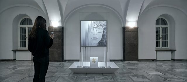
hash2ash by panGenerator is an installation that uses multiple modalities to convey a unique, individualized interaction between the visitor and the installation. As a user inputs their selfie onto the given link, a granular display of their selfie appears on the big display, and as soon as the image appears, all the particles that make up the image start to fall and disintegrate. The digital rendering is accompanied by real falling pebbles (“ashes”) underneath the display, adding an auditory and tangible experience to what is considered as a very virtual act of taking selfies. The essential idea of the project is to convey the fear of losing all your digital records due to technical failures.
This project is one my favorites, as the digital and physical rendering are beautifully linked together through code. I like how controlled the “waterfall” effect is on the screen and how the animation precisely matches the falling grains below the screen. Each grain feels alive when you take a closer look. I’m inspired the way the computation imitates real life physics, yet opens up a vision into a fictional world.
I’m not sure how many people were involved in making the piece, but the studio that produced this is a relatively small organization, so I imagine less than 20 people were involved.* I’m fairly positive that the artists developed their custom software to develop it.
*EDIT: panGenerator is made of only four artists!
 “cclchh” by Manolo ide