Charted Territory Timekeeper
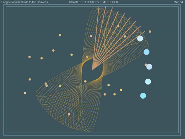
I was inspired by Dr. Donna Carroll’s lecture about the history of timekeeping, and I was so enamored with the ways of timekeeping before knowing time was a necessity. I’ve always love astrology, so I decided to base my inspiration off of charting maps and celestial time in astrology and the overlaps that are drawn between planets, moons, and stars. Included in my picture of inspirations, there were orbit maps that mimicked geometry curves. At first, I used an epitrochoid curve instead of my ellipses to demonstrate seconds, but I found it a little too busy on the canvas and I found it difficult to track with seconds. So instead, the seconds are measured with the rotating elongated ellipses (resembling orbits) as well as measured with the stars in the background (each star is added every second). Minutes are measured with the lines that resemble chart lines, but it also looks resembles our traditional clock design. The hours are measured with the circles rotating around (resembling lunar cycles), and one circle is added per hour. One detail I included was that the minute lines are spaced evenly for each “moon” to fit so it looks like the chart lines could be a measurement for the moon.
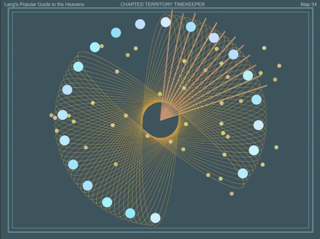
@ 9:12pm
@ 5:09am
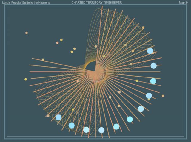
@ 11:47am
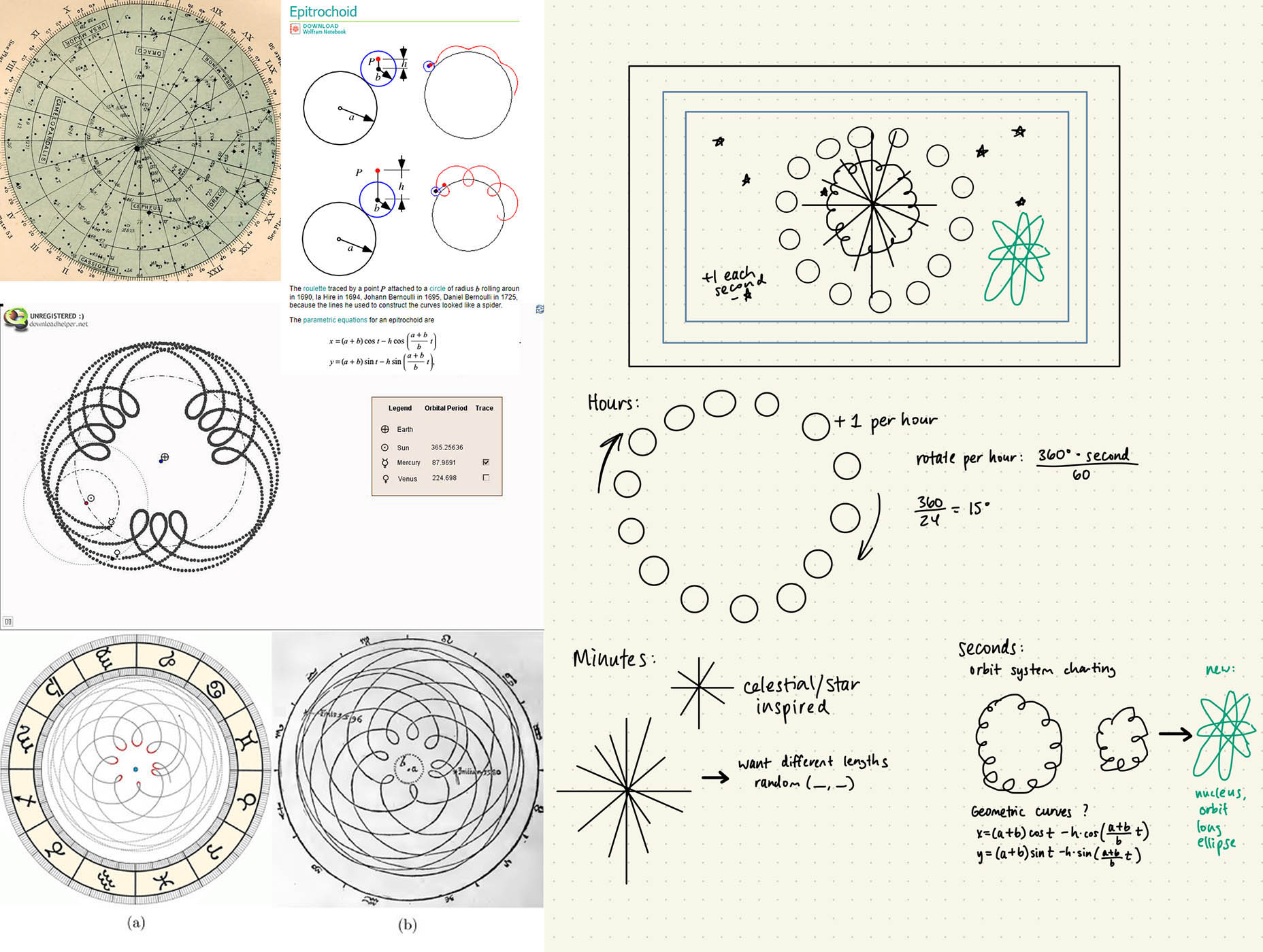
Inspiration images (left) and my sketch (right) – Click image to expand